Te Hā Puoro
Agency: Brave
MY ROLE
As a Junior Designer at Brave, I worked alongside the art director and creative director to develop the brand identity and present it to the client.
Art Director: Erika Wilson
Creative Director: Brendon Doig
BRIEF
Ngāi Tahu gifted the name Te Hā Puoro to Christchurch Schools’ Music Festival, meaning ‘the breath and essence of music’. The aim was to create a contemporary identity that honours this meaning and reflects music as a collective expression, strengthening connections across the community, from alumni to current students.
SOLUTION
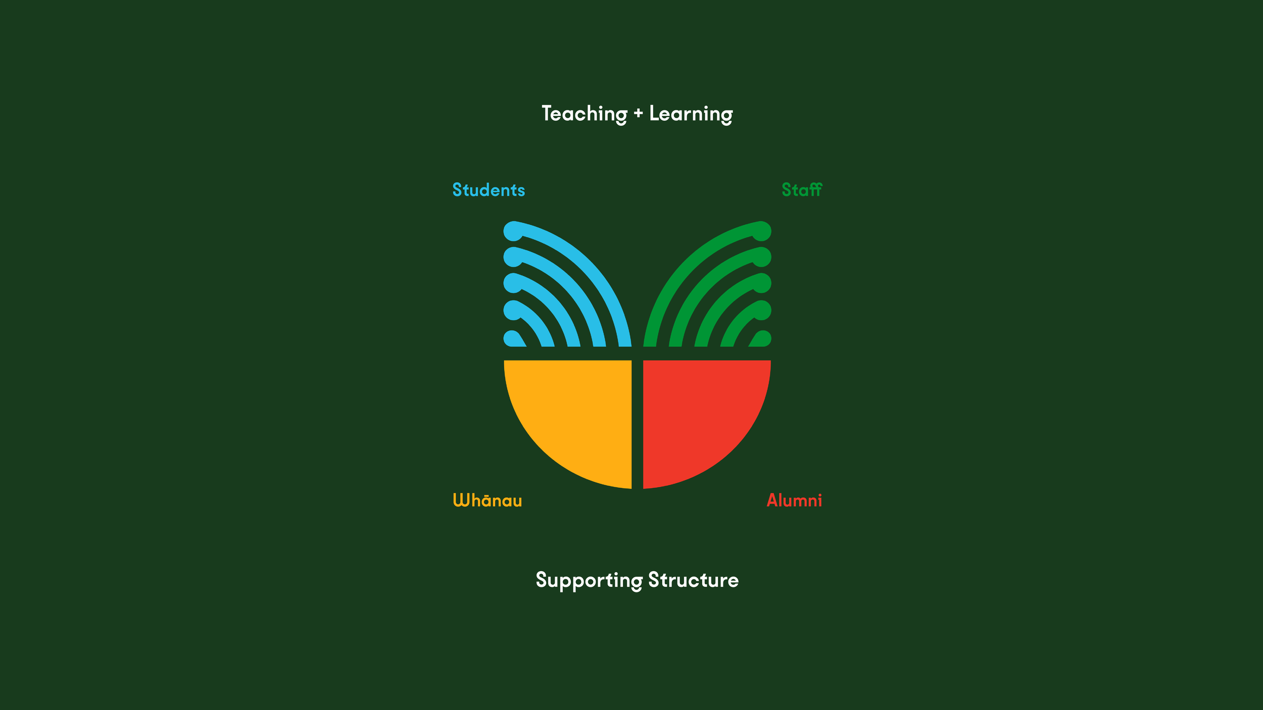
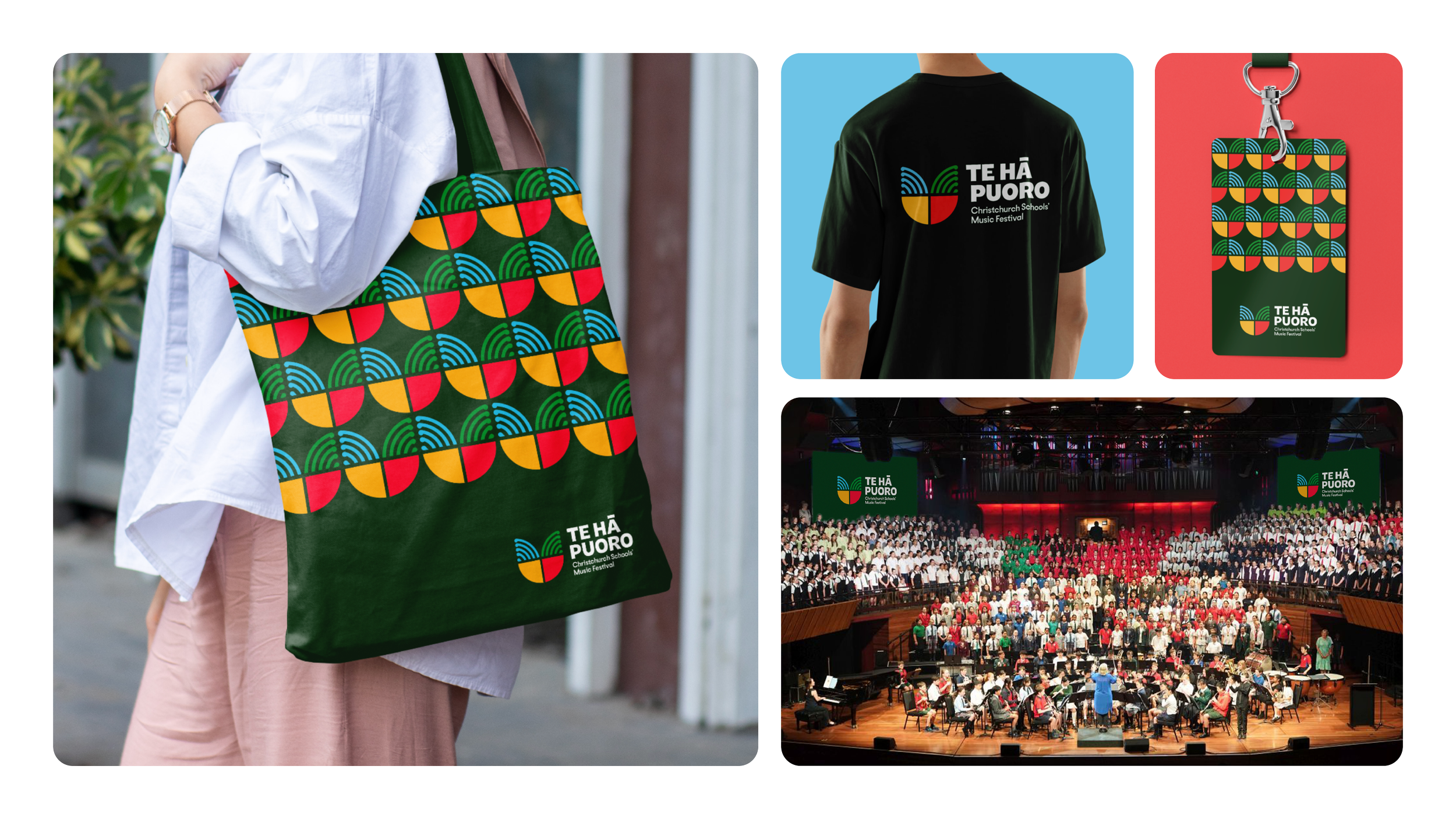
The identity brings together the voices that shape the festival: students, staff, whānau and alumni. The five curved lines represent music in motion, like sound waves formed through breath and shaped by the growth of a koru. Together, these elements create a bloom-like mark that celebrates music, connection and shared growth. The icon extends into a repeating pattern inspired by the rhythm of inhale and exhale, reflecting breath as an ongoing cycle of exchange.

Before